Dance Final 1
Dance Final 2
FINISHED FINALLY! I wasn't sure about that feather overlapping on their legs so I did 2 images. Anyways... colour away!
Thursday, February 28, 2008


Tuesday, February 26, 2008
Film idea, DANCE AND PARTY PANEL

Last weekend I found this projector and thought this may be a good angle for the Film panel.
We could include a silhouette of the grandfather and grandchild with popcorn and have a 30's movie playing on the screen.
If you are looking for something to do for Thursday, bring some images of scenes from famous 30's movies and/or have a shot at redrawing the figures in the film panel.
Also: Let's let the Dance and Party panel rest as-is. I have some drawings to show everyone based on the group's ideas, drawings and conversations with Joe.
See you soon!

Here is the final sketch for the frames. Don, the top-notch shop tech, suggested wood instead of metal since it would cost more and be REALLY heavy. The only areas we need metal are for the corners and the middle, since we plan to take the frames apart after every painting session. I called Stuart Lumber and Discount steal. The price for the wood is $216.50 for twenty four pieces of two by eights, and each piece of metal is $12. We thought we needed twenty four pieces, but Discount Steel sells each piece by the foot. I'll ask Don exactly how much we need since we might end up buying more metal than we need. Either way, It wouldn't hurt to buy a few extra materials just in case we mess up during the first try. I can't wait to start making these frames! Ok, goodnight.
Deco-ized elements

 I changed, as per Elissa's request, the tree and the details on the houses to make them simpler, more Art Deco, more geometric. Anyone please e-mail me if you want these files to screw with or try colors or say "what was he thinking?" or anything -- s'all good.
More details about Joe's feedback
Hello everyone!
Please read asap.
I was able to meet with Joe last night to discuss the feedback he has gotten from customers about our mural designs. Similar to my email to you all on Friday morning, he says people find the murals too realistic and busy. He feels as though he asked us to include a million elements and that is why they have come out busier than desired. He wants to remind us that we are on our way to something and that what you have done so far is very good, but needs tweaking. I agree.
I have been checking the blog to see what work has been done so far this week and I know it is difficult to work this way especially when Joe came back with a majority of his comments after out class meeting with him. But, these are how things go.
The words for the week are: SIMPLIFY and DECO/AZTEC.
We need to take what we have done and push it into more of a Deco/Aztec style with geometric flair and lessen the realism.
Nicole posted border designs that are more in sync with the architecture. Make sure you check them out. I will bring a bunch of printed copies of those borders to class on Thurs.
Jake has been redrawing and coming up with some new lay-outs. I really like the new dancing pair on the bottom and would love to see these drawn/colored in more of an Art deco style. The new band guys are great and more stylized but still too busy, I am afraid. I think we should work with this image:

There could be some great Deco lines made by the floor lighting. I would like to see some of Sarah's musicians added into this scene.
I asked Ed to submit some Art Deco images and really simplify the backgrounds in the panels. I WOULD LIKE EVERYONE TO BRING COLOR ART DECO or AZTEC IMAGERY TO CLASS ON THURSDAY- grab some books from the library and mark pages that have similar imagery to our murals.
If you didn't read my email on Friday, the Gesso team is now available to help the Color and Design teams. I have a revised plan for gessoing that will be quicker and we can do as a class.
Greg and Carol: Would you bring imagery of famous black and white movie scenes to Thursday's class? I will email back the same of the movies Joe mentioned. I would look for scenes that were simple and included a woman.
Ok, everyone. Keep working hard. Thursday's class with be another big cut-n-paste drawing and coloring session, so bring whatever supplies you like to use as well as everything you have drawn for the mural up to this point.
Thanks!
Elissa
Monday, February 25, 2008
Music Panel: Simpler Style

So this is quite a few figures, but it still has strong symmetry and stability as a compostion. I'll see how it works in a square with a border. I used as few lines as i could to describe the forms, as was the case with deco figurative works. They are stylized in a way that could be rendered pretty flat i think, but still, they are drawn well enough to maintain spatial relationships and one point perspective. I might play with color a bit too, but the color group could do some experimenting with these.
Joe says: Art Deco-it up
Okay, so as per Joe's request, we need to Art Deco-up the panels. Elissa asked me to take the houses in the Dance panel and the tree in the Party panel and Deco-ize (not redraw exactly, but take what we have and play with) them.
I will do this tonight and post what I have tomorrow (Tuesday).
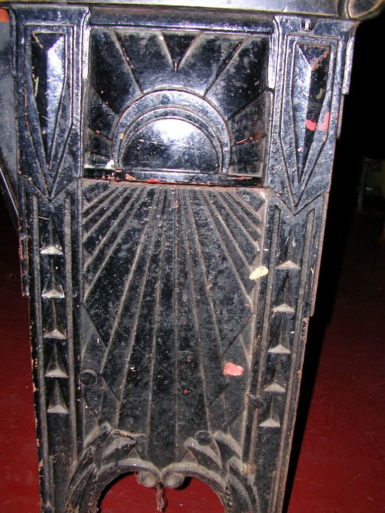
Here are some examples of Art Deco images. We want simplified, stylized, more geometric, less realistic -- to match the style of the Parkway. Bold, "masculine" linework was requested. Cleaner, more silhouetted imagery.


I will do this tonight and post what I have tomorrow (Tuesday).
Here are some examples of Art Deco images. We want simplified, stylized, more geometric, less realistic -- to match the style of the Parkway. Bold, "masculine" linework was requested. Cleaner, more silhouetted imagery.


Photoshoped Dancers...


I did some quick photoshop work and for the dance sketch... Jake all of these figure sketches are amazing, thanks for doing them... I'll see if I can get some work and ideas done on the film panel and perhaps a couple of others. These are just composition ideas. It's pretty similiar to the last version we had.
Sunday, February 24, 2008
Film panel
I got no ideas of how to push forward with the film panel. I also haven't really done much sketching for it which is probly why. I'll try to do some drawings for it tomorrow but any written or drawn suggestions on which i could elaborate would be much appreciated.
On-Stage Musicians


These are a few onstage sketches that are using viewpoint to adjust to what Joe said in the meeting - "try to tell the story in a less direct way." Working at all? They are definitely less direct and stable, but i didn't like the idea of including the actual parkway theater audience within the composition. Please comment so i can keep goin with some direction. Or feel free to pull these drawings into photoshop and play with composition if you have time, or post some drawings in response.
Musicians Tuning & Rehearsing


Backstage approach? They are loose drawings but they were some of the ones that started to do something new in my opinion.
Street Musicians?

Joe mentioned the idea of placing the music panel outdoors like the dance scene. This is still very straight forward like the original music panel designed by sarah, but these figures are more informal and could be placed in the midst of a casual audience on sidewalk. Not sure if this is the right direction to go...
Correction
All of my comments on the dance gestures i posted are in regards to the bottom lower of the two drawings. Top one is less likely to work.
New Possibilities for Dance Figures


Here are some new possibilities for the foreground adult figures in the dance panel. Joe was mostly concerned with getting a more lively gesture in the male figure, and more contemporary clothing on both figures, possibly a scarf for the female. With that in mind i think the male with bent knees and guayabera shirt is the most effective. For the female we could always just adjust the figure that is currently in the panel if this one isn't doing any thing new for it. I think this female figure has a stronger art deco style though. The second drawing is probably not going to work in the composition too well but if you all should comment and let me know.
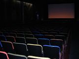
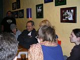
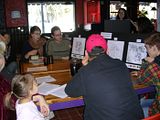
pictures
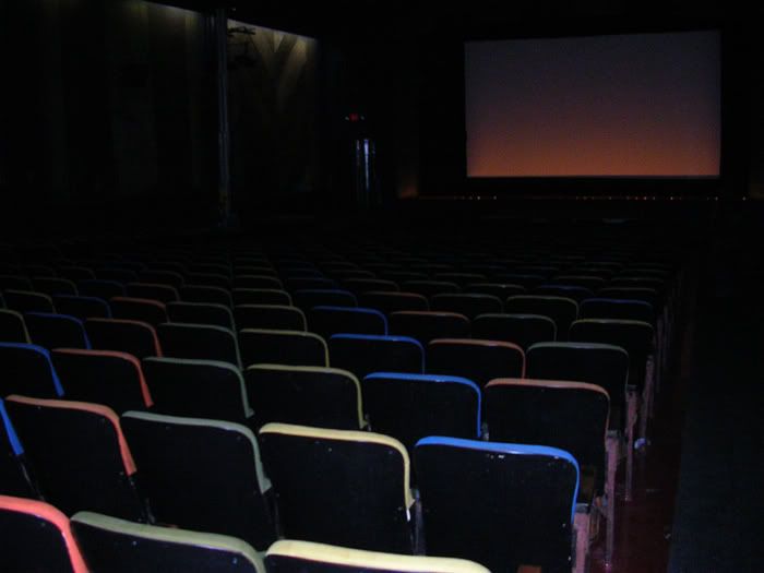
there are some of the back angle of the projector, some of the theatre, designs on the walls and chairs, and then there is a few of joe checking out our images from last week. In one of them he's smiling alot : D
**click on them to enlarge**


**click on them to enlarge**


Re: Borders and pattern
I like the way that the broad shapes in these borders have been organized (defenitely on the right track), but part of what is going to push both/either the art deco and aztec feel is richly decorative and referential patterns. If we are simplifying the figures and coloring, we should see that as an opportunity to complicate the patterning a bit more. From a personal standpoint, I think most of the patterning we have settled on up to this point has been rather unambitious (no disrespect intended to anyone's abilities). If many of the people in this class, as has been shown up to this point, are not that comfortable dealing with the human figure, then we gotta find ways for those said individuals to be involved, beyond just coloring in other peoples drawings. I'll post what i have a little later tonight, but I think some detail in terms of patterns would be a good place for the new additions to the design "team" to start. Think about how it's gonna translate to the painting process too, because thinking about what we showed joe, wood grain and curtains as predominant border features, those textures would not be easy to paint by any means (probably the hardest thing to render effectively in the whole compostion). Cool. I'll post some new figure drawings lata tonight.
Friday, February 22, 2008


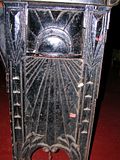
one border?
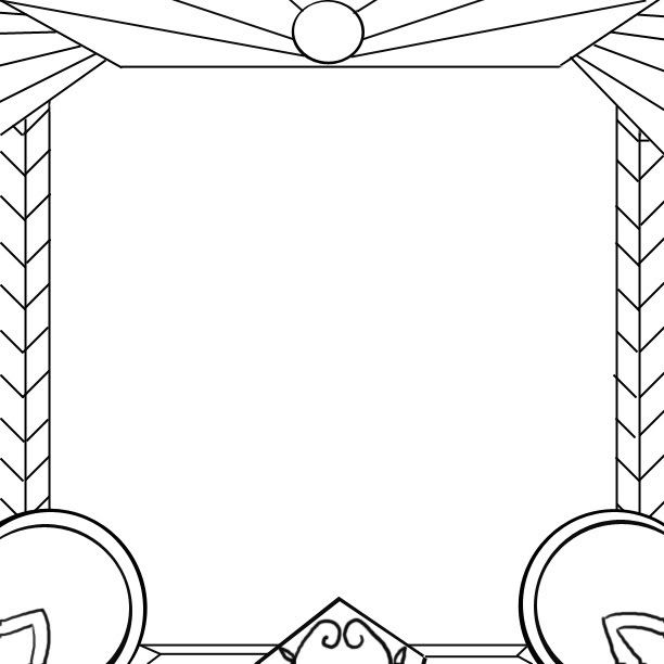
From what the teacher and the client are asking for with the new changes from the email is more architecture and historical designs. I think I'm on the right track here not sure, I'm going back to previous designs from the first few weeks were I was mostly focusing on the architecture.
The circle at the top of this image would hold the sun symbol. I didnt draw it in because I Dont feel confident on drawing it free hand on the computer. I dont know how to use the pen tool. But here is a digital re-done image from it.
Let me know if this is what were going for. I'll try to do a few more after this.
**click to enlarge**

Art Deco Push
Hello class,
I just got an email from Joe that he wrote at 2am last night.
He is asking that as we redraw the designs we reconsider the style of the theatre.
He says, "We need to get back to the deco, Mayan architecture. That's what should
frame the work. To me, what gets lost are the deco lines of the theater. The dark,
angular mood clashes with the realistic scenes of the murals."
I will call him to get more details soon but for now, let's consider this.
The border designs weren't completely done and I will explain out ideas to him as
well as point out how we went with the design on the chairs for the skeleton of the
borders. I do think we need to add elements of the initial Aztec/Deco border
designs we came up with into the borders. We could pull away from the fabric/curtain
references and go with more masculine deco lines.
I think we can also push some bolder lines in the figure scenes to pull away a bit
from the realism and echo the directness of the lines in the theatre architecture.
I don't want to entirely change our four figure panels- I want to show him how they
can still aesthetically combine with the deco/Mayan/Aztec architecture and have a
thematic impact/message.
Since we can't go anywhere without the design in place, I am going to ask that
CAROL, ED and GREG join the Design team with Nicole and Jake. (We can figure out a
new gesso plan in class next week)
I would also encourage the color team to pull away from realism and work on bolder
(not necessarily brighter), more definitive color choices. See Art Deco painting
for ideas.
So here is where we are at:
The borders and patterning are key to achieving what he is asking for. There are
Mayan/Aztec books on class reserve still in the library. Let's pull away a bit from
the Nouveau and push the Deco.
Backgrounds that are to be drawn (film, music) can be done in a bolder, more
stylized way.
Color should have more line work and Deco flair.
I will send another email soon with more details.
Hang in there everyone! We want him to love these!
Thursday, February 21, 2008

Wednesday, February 20, 2008
party


here is the party mural with a background. one has houses and the other has houses and trees. i think the one with just houses looks better maybe? i think trees seem "natural" in the image and it might look better once it is colored.
i dont know
I dont know what I'm supposed to do or whats going on.
I did a quick sketch of something before. Then I heard others were working on the film panel. Then there was a sketch, so I really dont know, I put together the sketch and the border and just gave it a ground line because I wasnt sure what the background was.

I did a quick sketch of something before. Then I heard others were working on the film panel. Then there was a sketch, so I really dont know, I put together the sketch and the border and just gave it a ground line because I wasnt sure what the background was.

Film Panel
So what's good with the film panel? Not to be a nuisance or anything i'm just anxious. A post by tonight or tomorrow morning would be comoforting since we're showin them to joe in the afternoon. Even if it's unfinished, i could work on it in the morning if someone posts it tonight, as i'm gonna be putting together some new borders for the panels me and greg did (though i really like the dynamic quality of the curved borders in both of them). Communicate yo.
Tuesday, February 19, 2008

Dance Panel

Here is the dance panel, sorry my post this afternoon apparently didn't work. I haven't re-done the border yet but it seems greg didnt do a new border either, so I'll come up with some options for both the party and dance panels by Thursday for sure, but possibly by tomorrow. Word up.
Subscribe to:
Posts (Atom)